- Delesign
- Posts
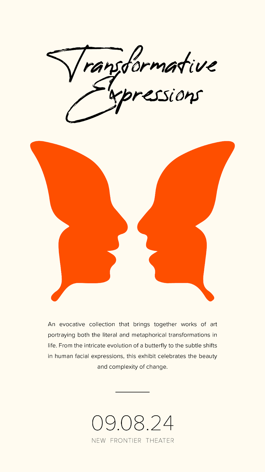
- Delesign Digest: Balance
Delesign Digest: Balance
Delesign Digest
Amplify Your Marketing Impact One Insight at a Time
Design Principle of the Day: Balance
Ever felt like your designs were just... off? You've got all the right elements, but something's not quite clicking. This is a common struggle many marketers face. Your design might be packed with great content, but if it lacks balance, it can feel unsettling to viewers. We recently helped a client redesign their marketing materials using the balance principle.
Balanced, Harmonious Design
We achieved balance through:
Symmetrical distribution of elements
Strategic use of white space
Consistent color palette
Varied element sizes for visual interest
Thoughtful placement of text and images
Key Results:
Improved visual appeal and professionalism
Enhanced readability and information flow
Increased viewer engagement and retention
We accomplished this by:
Distributing visual weight evenly across the design
Using both symmetrical and asymmetrical balance techniques
Considering the relationship between all design elements
Why This Matters for Your Marketing: Balance in design isn't just about aesthetics - it's about creating a visual hierarchy that guides viewers through your content effortlessly. A well-balanced design can significantly improve the effectiveness of your marketing materials, leading to better engagement and conversion rates.
Quick Tip: Next time you're working on a design, step back and assess its balance. Is the visual weight evenly distributed? Are elements competing for attention? Keep refining, and you'll see your designs become more polished and effective.
Design with purpose, design for impact!
Need help balancing your designs? Set up a call here.